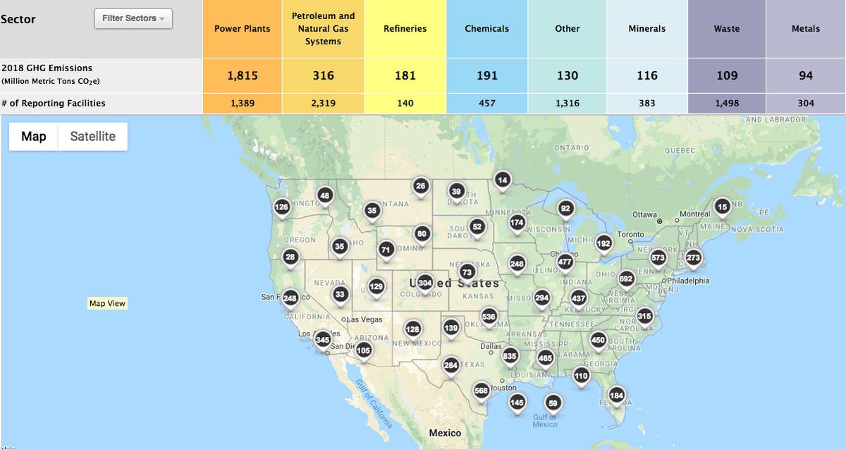
The EPA recently released an interactive online greenhouse gas map that includes emissions data for individual facilities. I've been following the evolution of the EPA's mapping technologies for the last seven years and this is their most impressive offering to date. The maps are served quickly, the user interface is mostly intuitive, and the data can be filtered and sorted before being displayed as a map, list, or graph. It would be great if the map also included facility data on criteria and hazardous air pollutants.
I filtered the map to display all the refineries and chemical factories in the United States and as I suspected, my home town of Houston, or more accurately the Houston Ship Channel, is the epicenter. I also checked the geographic accuracy of the EPA's facility data by comparing their map of New York City power plants to the map of power plants HabitatMap created in partnership with Sustainable South Bronx that identifies "peakers". Unfortunately the EPA markers identifying the locations of the power plants is not very accurate. It appears as though they gecoded the locations using addresses rather than latitude and longitude.