This scary map from Greenpeace maps U.S. chemical plants and their potential poison gas cloud fallout zones. Like the EPA greenhouse gas map I blogged about a few weeks back, the Houston Ship Channel area has the densest concentration of facilities followed by the "chemical corridor" between Baton Rouge and New Orleans. It would be great if this map was bigger and the facilities list generated by address searches generated a complete rather than a partial list of facilities. There should also be a way to toggle off the fallout zones because they obscure the underlying map.
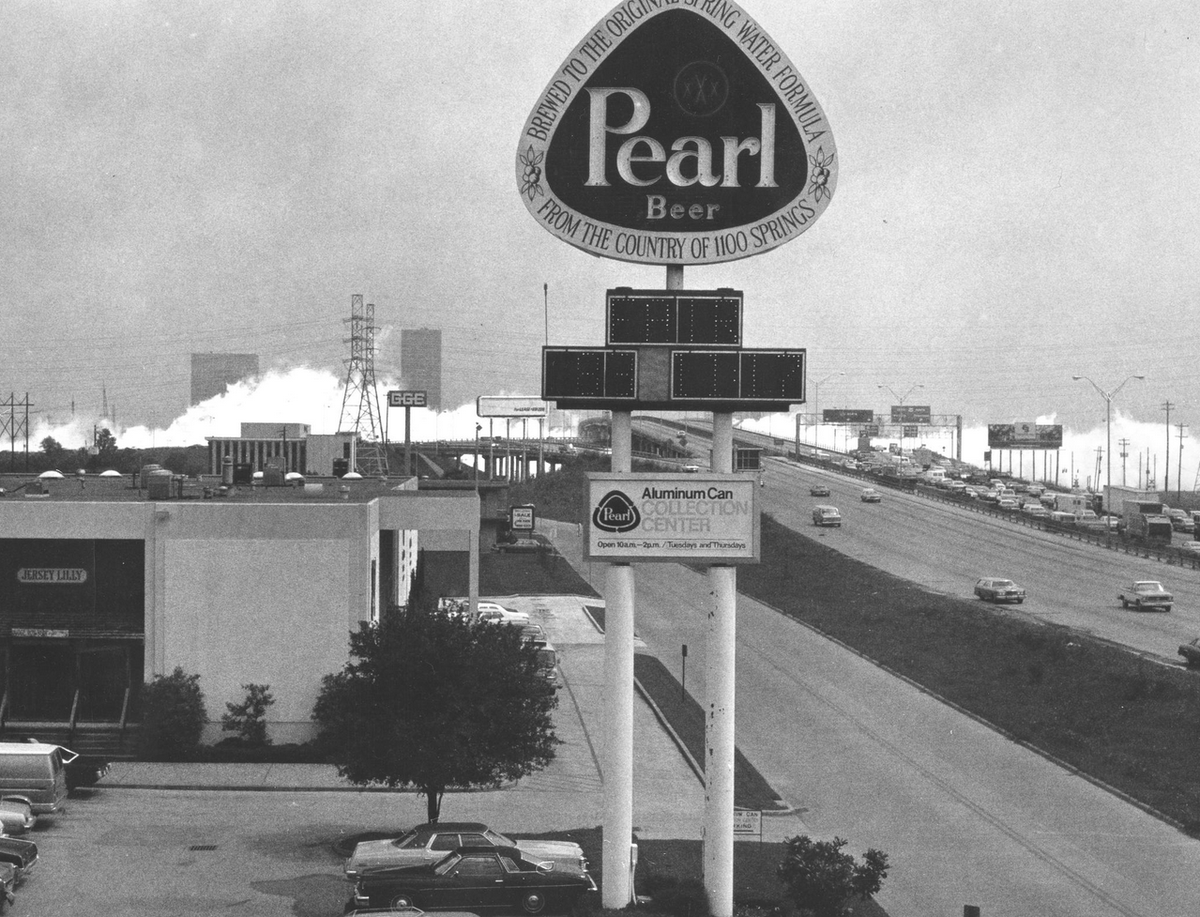
But mostly what this maps needs is a better explanation. I'd like to know what types of chemicals pose the greatest threat and I'd like to know how often these types of accidents have happened in the U.S. Growing up in Houston I remember hearing about an ammonia tanker truck that crashed at the intersection of the Southwest Freeway and the West Loop releasing a toxic cloud that killed seven people and led to the hospitalization of seventy-eight.
Clicking through the markers, I see lots of chlorine plants. What is all this chlorine for, people's pools? According to the law firm Williams Kherker, which represents chlorine gas refinery workers who have been injured on the job, "Chlorine is commonly used in cleaning and sanitation efforts. It is found in drinking water and swimming pools, as well as being used in industrial settings such as oil refineries. Sulfur used in the oil refinement process creates a large amount of pollution, which is reduced when chlorine is added into the sulfur emissions."
 Get AirBeam