Have you ever opened the AirCasting map, seen those brightly colored dots scattered across the screen, and wondered what they really mean? You're not alone. Those colors aren't just for show, they tell a powerful story about the air you're breathing. Once you understand them, they can help you make smarter decisions to protect your health.
The Air Quality Index: A Quick Guide
Those colorful dots are based on the Air Quality Index (AQI). The AQI has been around since the 1970s and was pioneered by the U.S. Environmental Protection Agency (USEPA). It was designed to represent health risks from common pollutants people encounter, like car exhaust or smog. AQIs vary from country to country, using different indexes and color schemes. In the United States, the AQI runs from 0 to 500 and is divided into six color-coded categories that represent different levels of air quality. Higher AQI values correspond to higher air pollution measurements and more serious threats to human health. The USEPA AQI also offers guidance for sensitive groups, such as individuals with asthma and the elderly, recommending they adjust their daily activities based on how severe the air pollution is.
Let’s break it down:

What is the AirBeam Measuring?
AirBeam is a portable air quality monitor that tracks particle pollution, tiny airborne particles from sources such as fossil fuel power plants, wildfire smoke, truck exhaust, and cooking. These particles are small enough to reach deep into your lungs and even enter your bloodstream. Exposure to particle pollution can cause short-term health problems like headaches, pneumonia, and bronchitis. Long-term effects include strokes, heart attacks, asthma, lung cancer, and infertility.
AirBeam uses unit-based measurements - micrograms per cubic meter abbreviated as ug/m3 - rather than AQI numbers to measure particle pollution because providing actual concentrations offers precise data on the levels of particulate matter and allows for a more nuanced understanding of air quality and associated health risks.
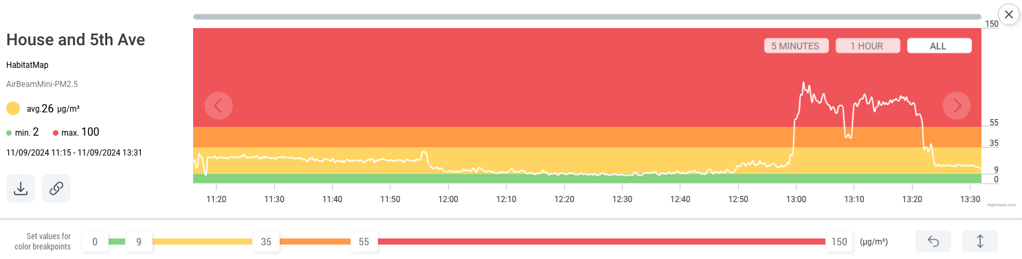
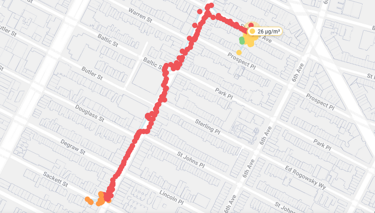
The AirCasting app and website use the National Ambient Air Quality Standards for PM2.5 exposure and the AQI to relate colors to measurements: 0-9 ug/m3 is green, 10-35 ug/m3 is yellow, 36-55 ug/m3 is orange, and 55-150 ug/m3 is red. (The relationship between colors and measurements can be changed inside the AirCasting app and website.) These ranges/colors roughly correspond to increased health risks as the concentration of PM2.5 in the environment rises.
What Are the Major Air Pollutants?
While the AirBeam focuses on particle pollution, the AQI is based on five major pollutants:
- Ground-level ozone
- Particle pollution (PM2.5 and PM10)
- Carbon monoxide
- Sulfur dioxide
- Nitrogen dioxide
Each of these can affect your health, especially for vulnerable groups like children, older adults, and people with asthma or heart disease.
Pros and Cons of the Air Quality Index
Pros:
- The straight-forward, color-coded nature of the index makes it easier for the general public to understand air quality readings and make informed decisions to protect their health.
- It warns the public when pollution levels are high and could harm health, especially for children, the elderly, and people with breathing problems.
- The AQI helps local governments track air quality and make sure it meets safety standards.
Cons:
- The AQI may mask which specific pollutants are responsible for poor air quality, potentially limiting people’s understanding of the distinct health risks posed by each one.
- The AQI is based on 24-hour exposures because most health studies have primarily examined long-term exposures to air pollution, not short-term exposures, leaving the potential health implications of such exposures unclear.
- The Air Quality Index only takes into account the five criteria air pollutants mentioned above. It doesn’t take into account exposure to hundreds of hazardous air pollutants (e.g. formaldehyde, benzene) like those released from petrochemical plants or urban fires.
- Data shows that health effects occur at levels well below current regulatory thresholds, especially for the most toxic aerosols, like those from diesel exhaust.
Making Air Quality Data Easy to Understand
Air quality data has traditionally been hard to access or interpret without a background in environmental science. But tools like AirBeam and AirCasting are changing that by giving everyday people the power to see and respond to air pollution in real time.
With a quick glance at the air quality data, you can decide:
- Whether it’s safe to go for a run
- If your child should wear a mask today
- Where in your city the air is cleanest
Empowering People, Not Just Scientists
Understanding air quality isn’t just for researchers or policymakers - it’s for everyone. Clean air is a universal human right. Knowing what’s in the air you’re breathing is the first step toward protecting yourself and advocating for healthier environments.