We launched the AirCasting app in December 2011. Over the past two years we've rolled out a slew of new features but never had a chance to rethink the user interface. That is until about three months ago when we found the time, and most importantly, the funding.* Since then we've been busy translating the constructive feedback we've gotten from AirCasters the world over into a new and improved user interface. If you already have the AirCasting app on your Android phone or tablet, update it now! If not, head to the Google Play Store and check it out. Wondering how it all works? Have a look at the screenshots and "how to" below.
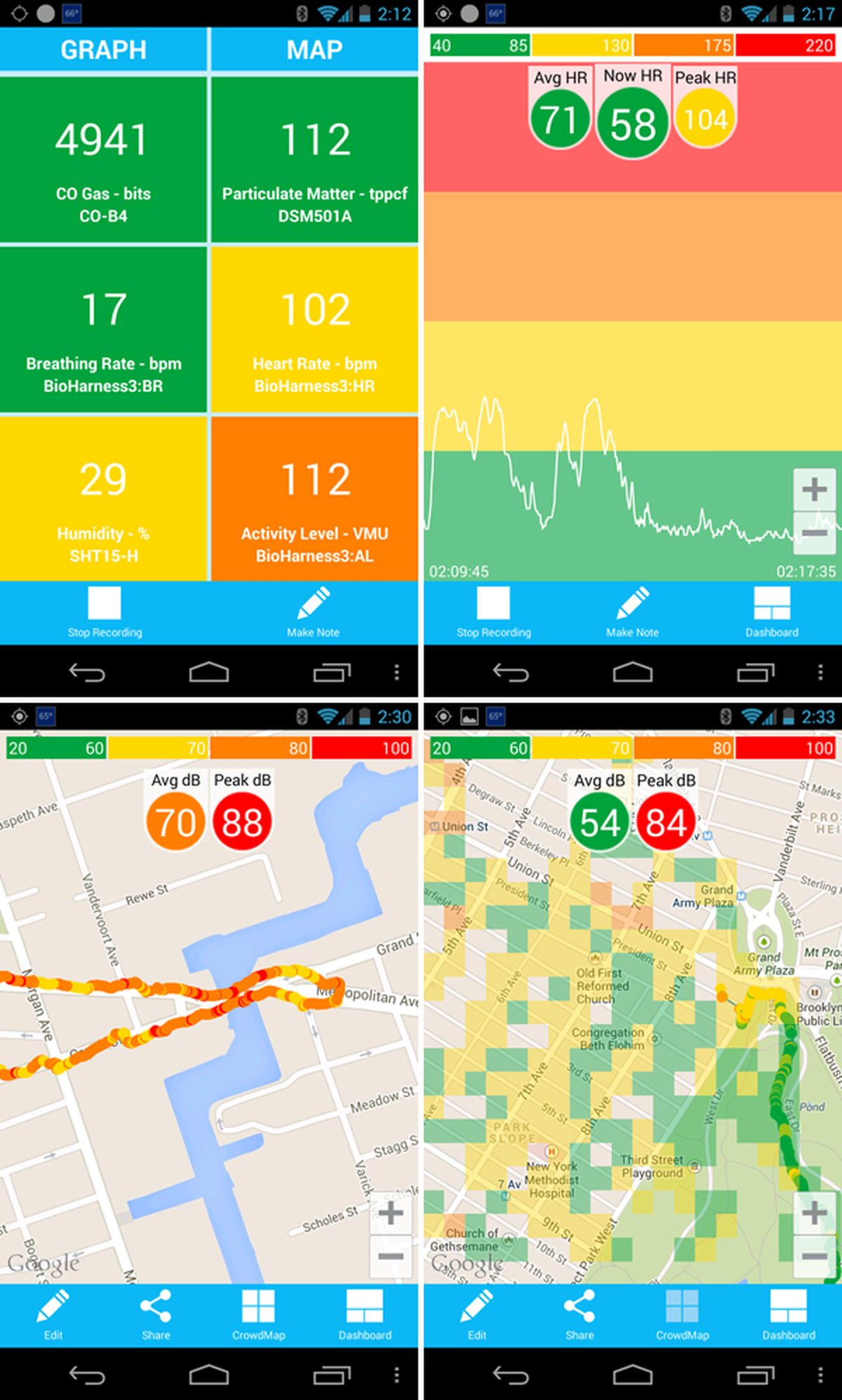
AirCasting provides three ways to view your sensor data: the Map, the Graph, and the Sensors Dashboard. The default view is the Sensors Dashboard.
On the Sensors Dashboard, tap sensor tiles once to hide/show the peak and average values for your session and tap the tile twice to pause the stream. To map or graph a sensor stream, long press the tile, then drag and drop it on the “MAP” or “GRAPH” areas at the top of the screen. Sensor tiles can also be rearranged using the long press, drag and drop method.
The Map displays your current position as a colored dot with a white outline; dots without an outline are past readings. A dot’s color corresponds to the reading’s intensity at a location. Refer to the “Heat Legend ” (the colored bar at the top of the screen) to identify the intensity range for a reading. For example, a yellow dot corresponds to a sound level reading between 61 and 70 decibels. To quickly toggle between sensor streams without returning to the Sensors Dashboard tap the “Avg” “Now” “Peak” circles at the top of the screen.
When viewing the Map, press the CrowdMap button to view the CrowdMap layer. The CrowdMap displays AirCasting data from all contributors. Each square’s color corresponds to the average intensity of all the readings recorded in that area. Refer to the “Heat Legend ” to identify the intensity range for a square. For example, an orange square corresponds to an average sound level between 71 and 80 decibels. If no colors are displayed, there is no data in that area.
The Graph displays your readings over time. Zoom in and out for more or less detail, swipe to pan through the data.
*Funding for this work was provided by The Hive Digital Media Learning Fund in The New York Community Trust.